SPLIT TONED BOSTON
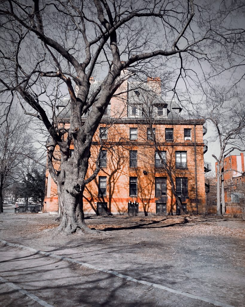
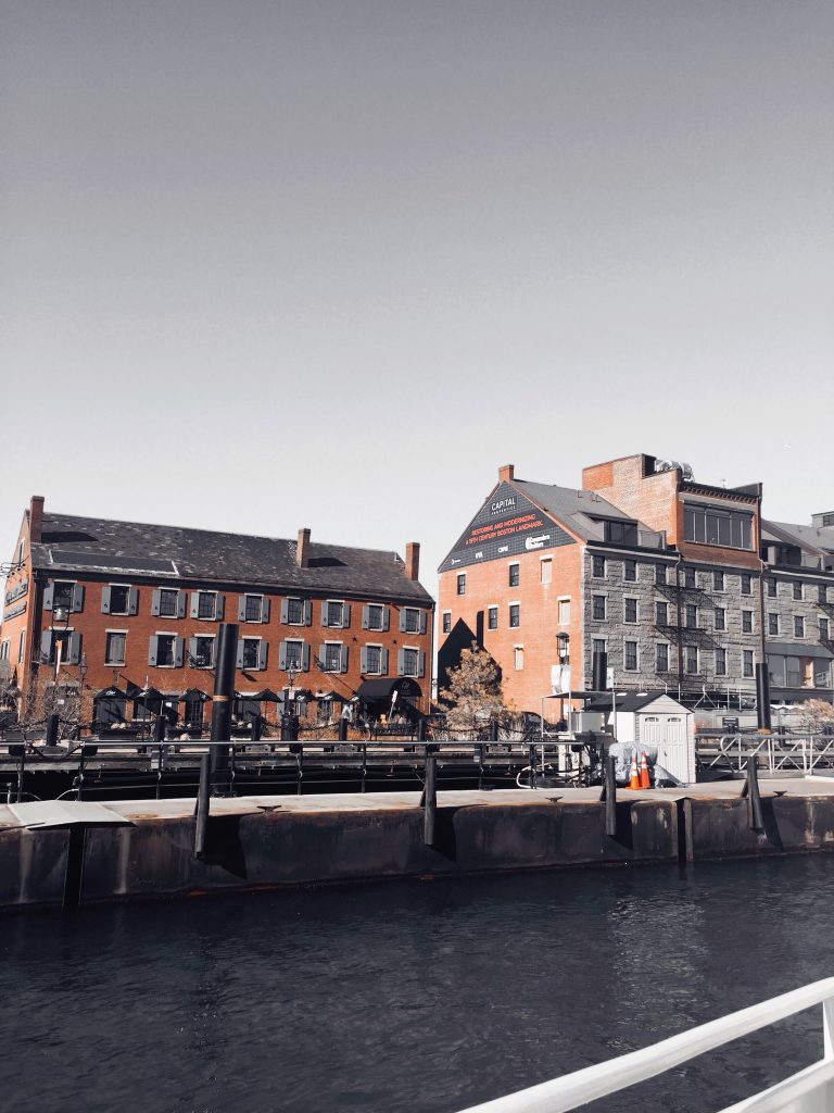
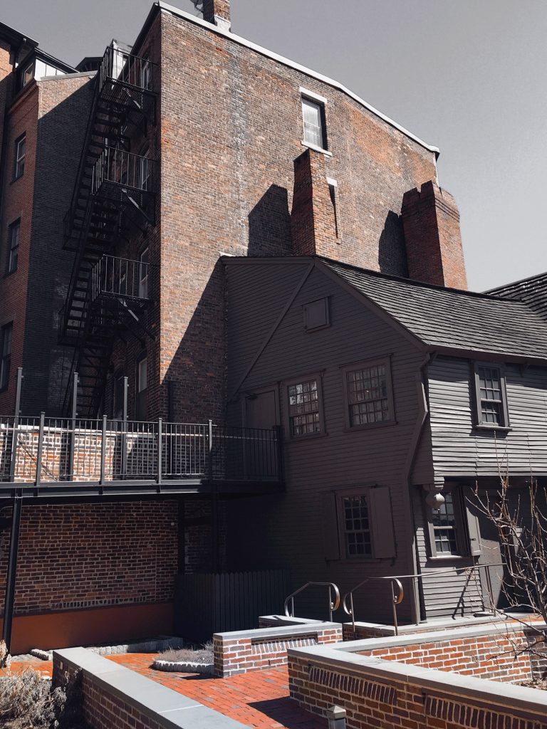

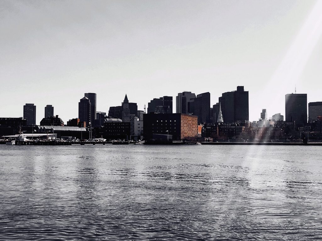
I edited these photos four or five months ago, coming up on a year since my trip. I love these because of the selective color. I used a photo editing app called A Color Story, I think it’s only available on mobile devices. My second favorite editing app, behind Adobe Lightroom. I’ve always enjoyed editing photos, ever since I was a junior in high school (that’s when the iPhone culture really took off). It was like a whole new world to me, containing more possibilities than I had imagined before. I know, it probably sounds like an oxymoron hearing a young person say that. Anyways, these are some of my very favorite Boston photo edits.
Striking, and stirring. I really love the colors you chose…especially where the bare trees are in the foreground, the contrasts are beautiful, and so earthy.
OMMMMMGGGGGEEEEEE I LOOOOOVVVEEE these…I will have to try that app… so far in my photography journey I have only cropped and converted to b/w but I am signed up for 3 hands on classes…including micro shoots, travel photos stories, and lightroom. Thank you for sharing such beauty.
My next post is written but selecting the “garden” photos from Scotland to go with the poetry.
Super job…stunning photos…I want to go to Boston!!
Stunning is the best word I can find too. These are incredible. I fear I would walk down the street and see buildings and cars and winter trees. You see beauty, capture it, and make ME see it in a different light. It helps me notice things I would otherwise miss. Careful little sister, you may end up with a whole bunch of us cramping your style on the next Boston adventure!!! LYS!!!
You are the queen of color! “Ms. Tetrachromatic” These pics definitely invoke a mood. I still remember that trip across the harbor and visiting Paul Revere’s house, oh, and the yummy smells of all those Italian restaurants in the North End as we walked around!
Such an unusual approach for standard city pictures! You made them come alive with the brilliant contrast of terra cotta red and gray earth tones in a most amazing way. Can’t wait to see more of your talent!